
CHI Transit is a mobile transportation app for the metro city of Chicago.
View the clickable, high fidelity prototype here.
OVERVIEW
Roles & Responsibilities
My client is a transportation agency for a midsize metropolitan area. My role was to take full ownership of various roles it takes to design a mobile application product: User Researcher, User Experience Designer, and Product Designer.
Tools Used:
Figma, Google Surveys, Zoom, word-of-mouth
Deliverables:
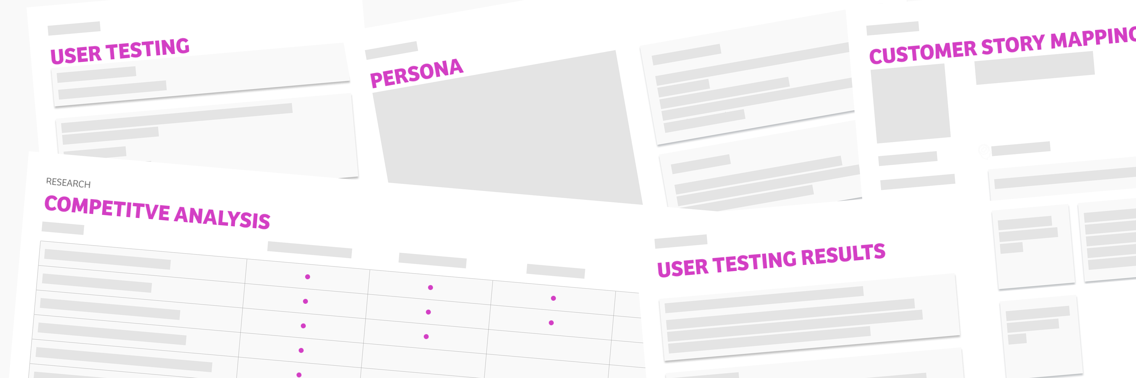
Competitive Analysis Report
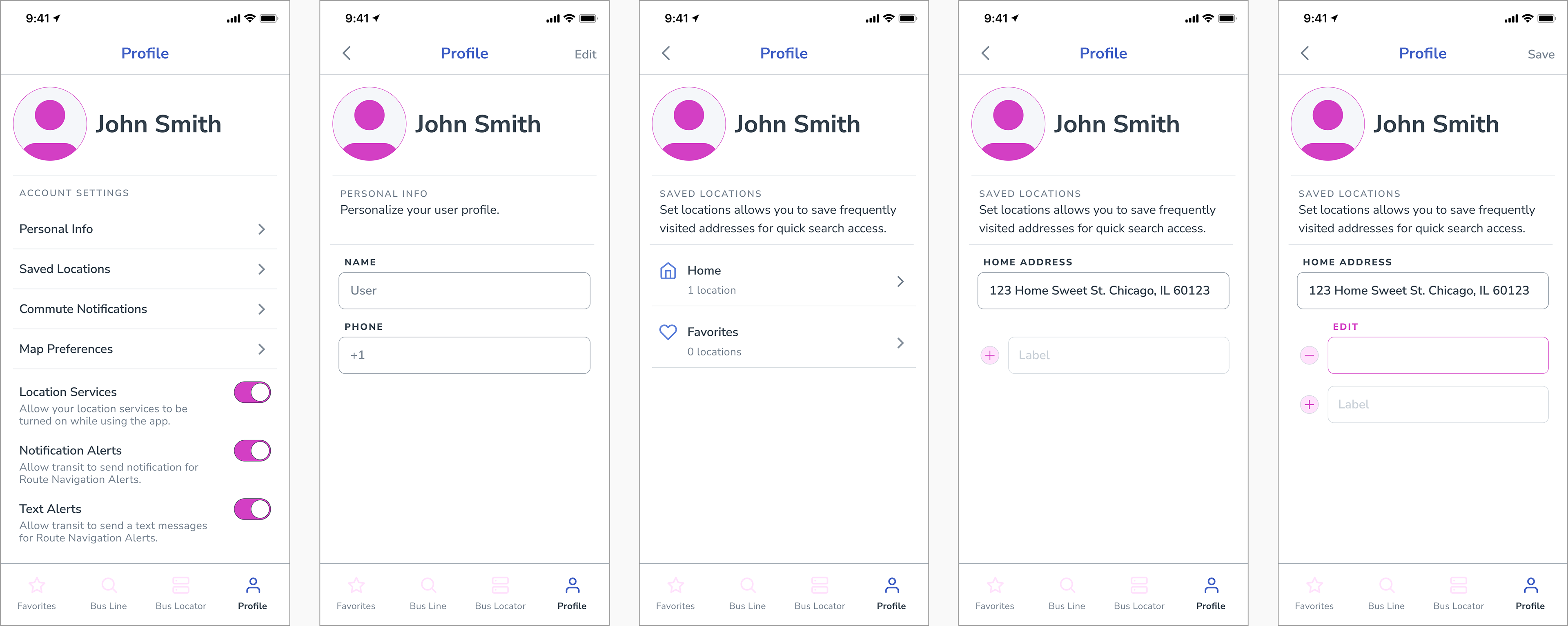
Personas
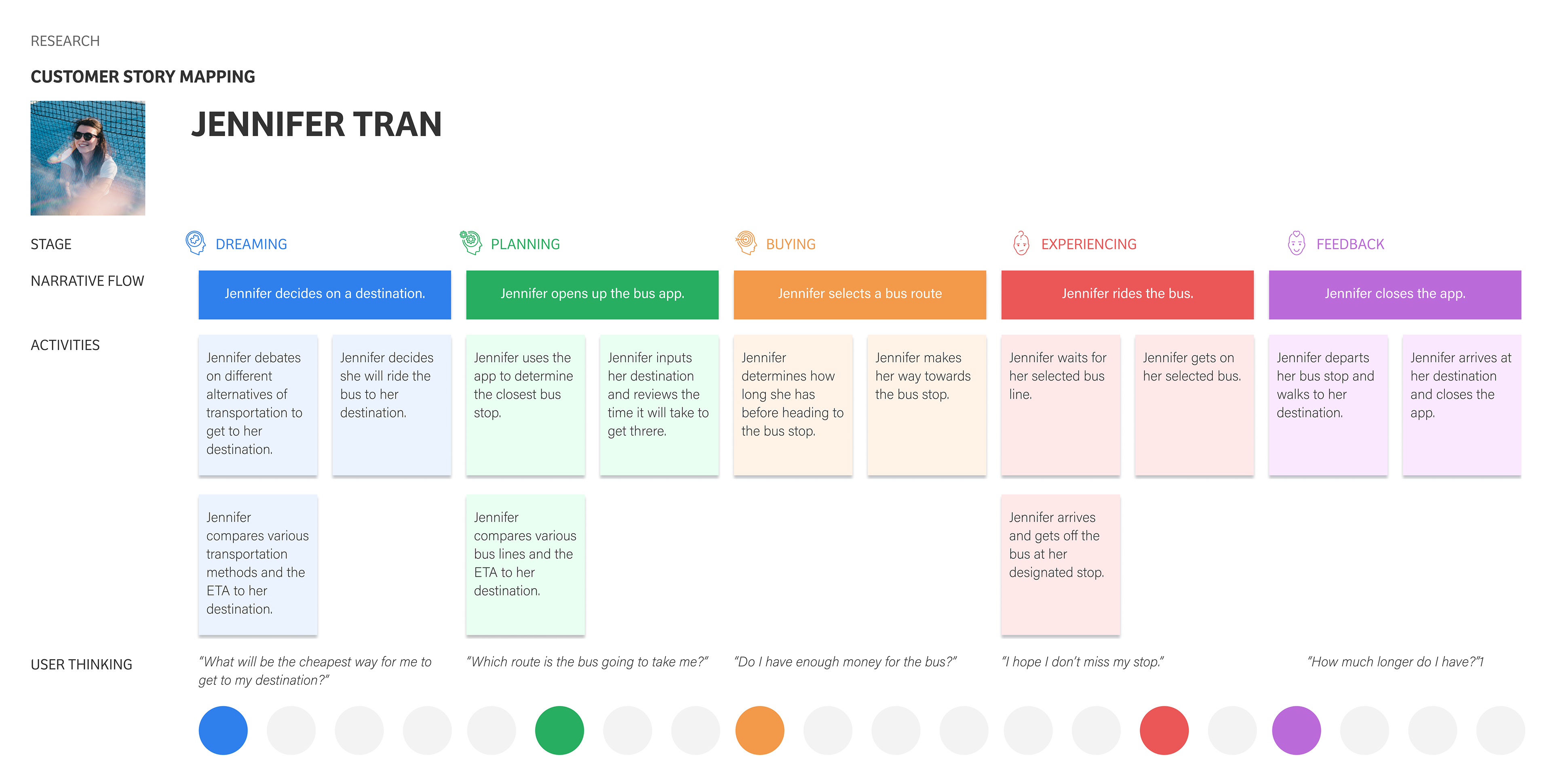
Customer Journey Mapping
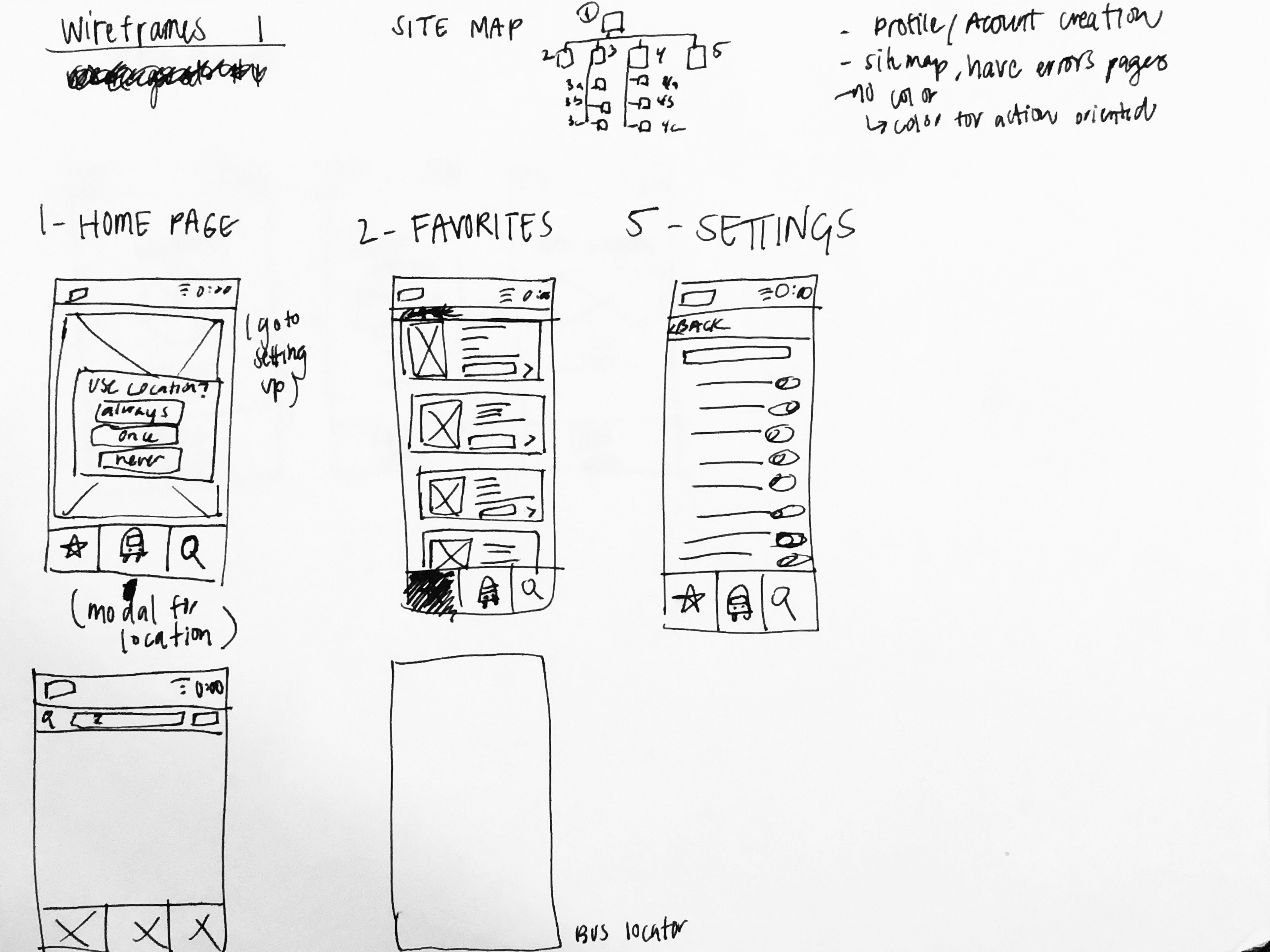
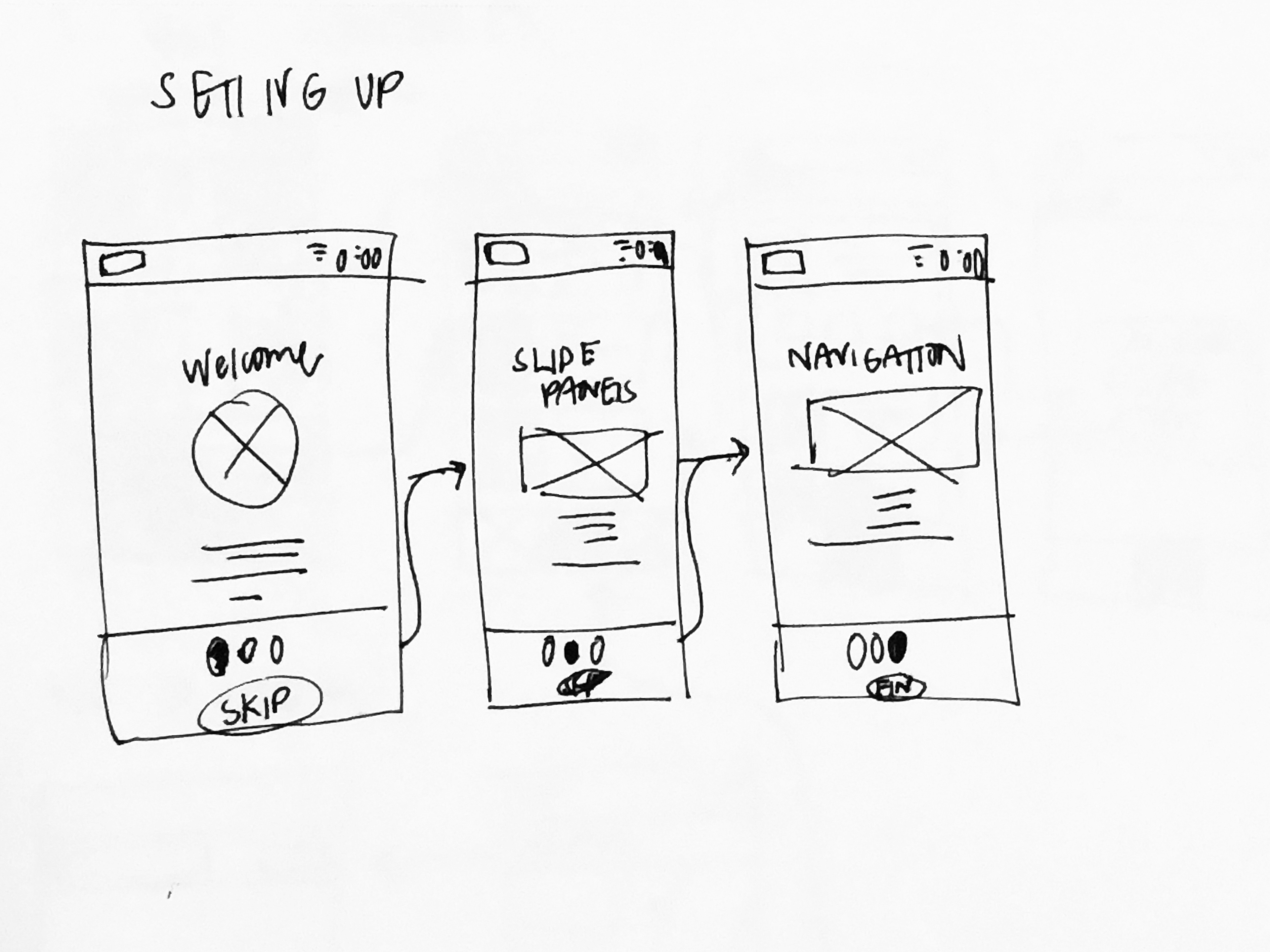
Wireframe
Low-Fidelity Clickable Prototype
User Testing Interview &
High-Fidelity Clickable Prototype
Problem
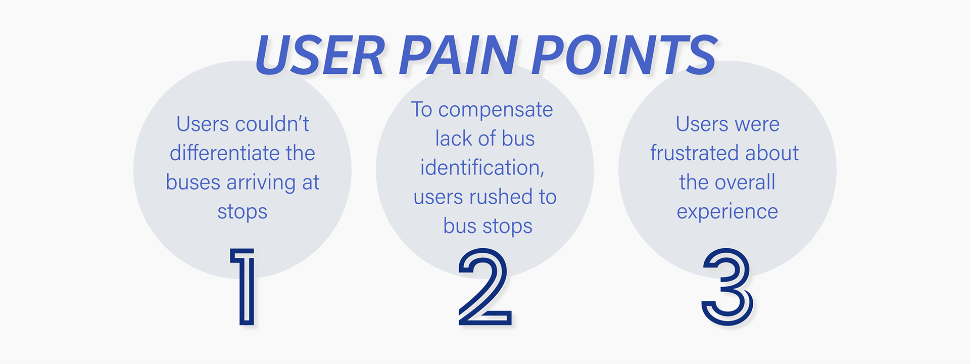
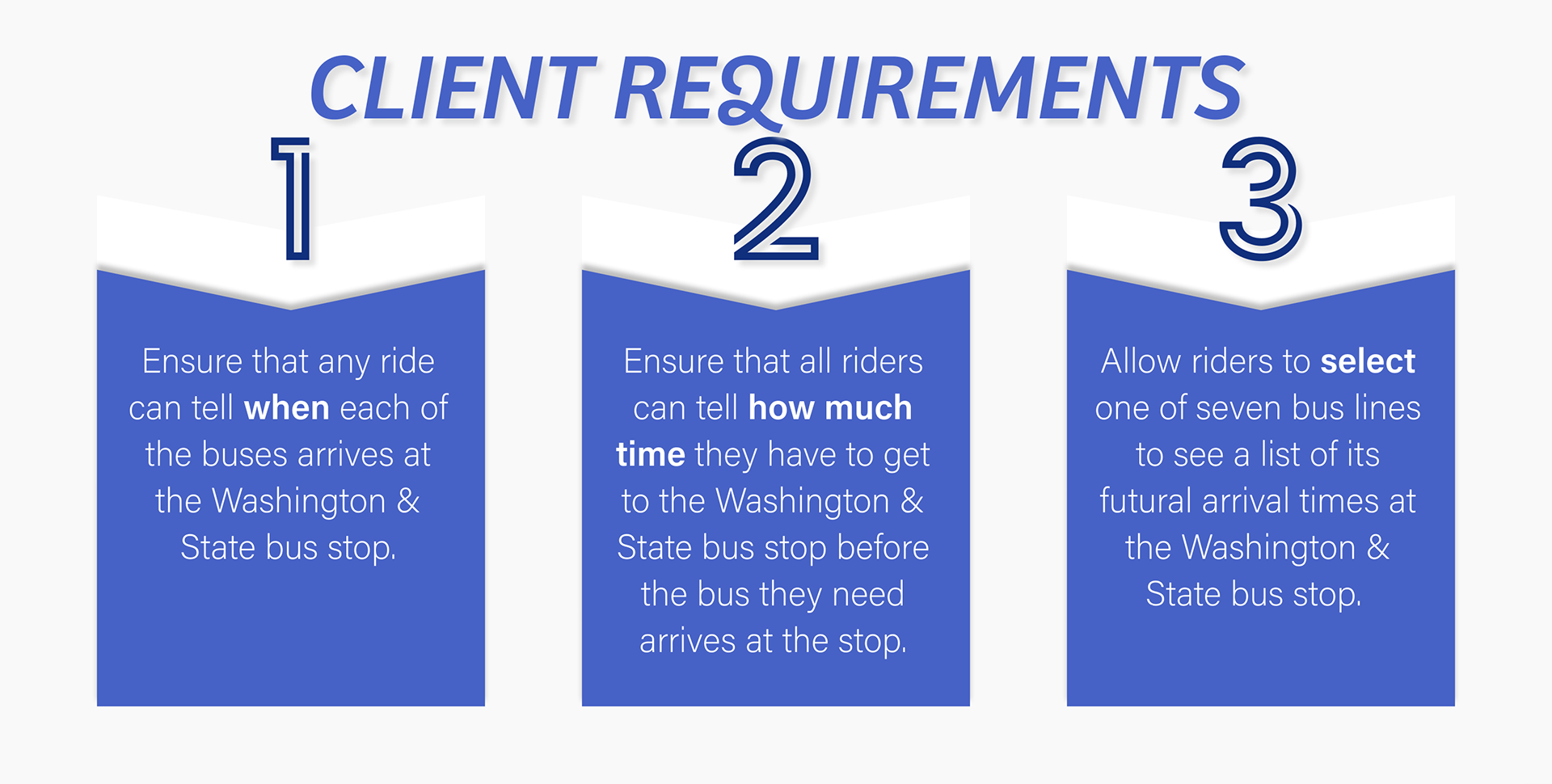
The transportation agency operates a network of public buses. They currently list their bus schedule on the website and at each bus stop. The agency recently expanded with new bus to allow multiple bus lines to share the same stop. Previously, with only one bus line arriving at a stop, commuters were able to see when their bus arrived. With the newly added lines, commuters are now unable to distinguish which bus is which. The agency has the data of when and where each bus is on their route, but does not have a platform to relay the information to users.

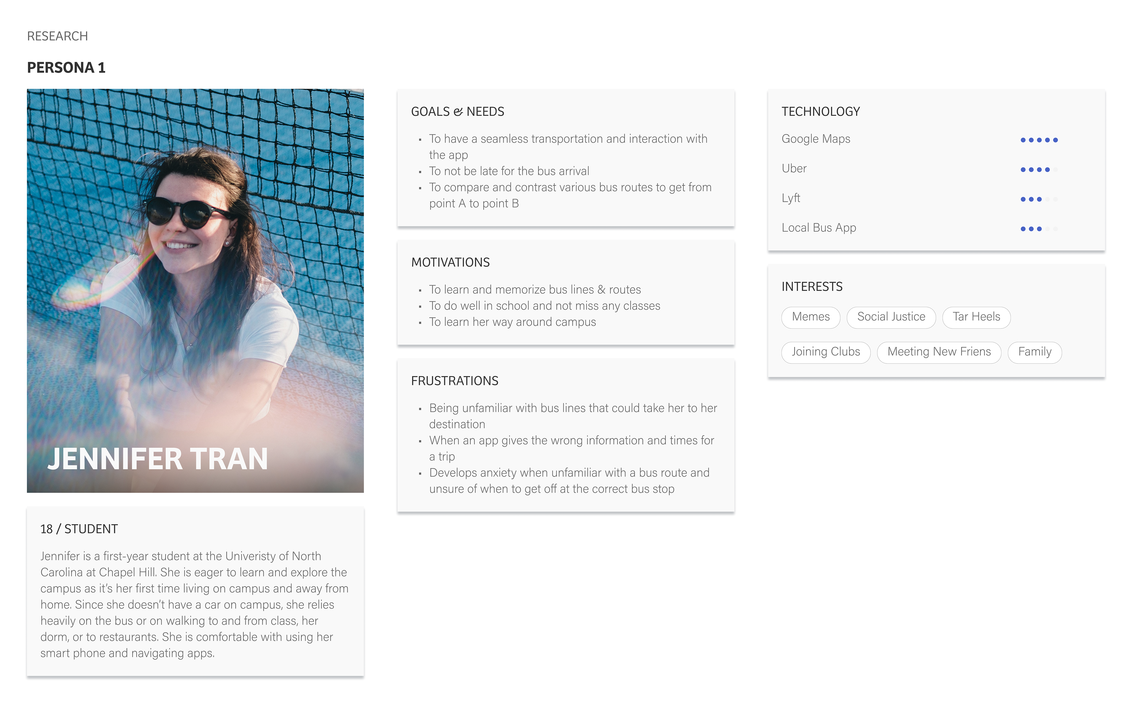
Audience
Our users range from daily bus commuters and one-time riders. For age, most are adults that has access to a smart phone.
We created a simple bus tracker platform for users to track various bus lines and assist in navigating their trip ahead of time. We also had to include our client's MVPs.
PROCESS
Research
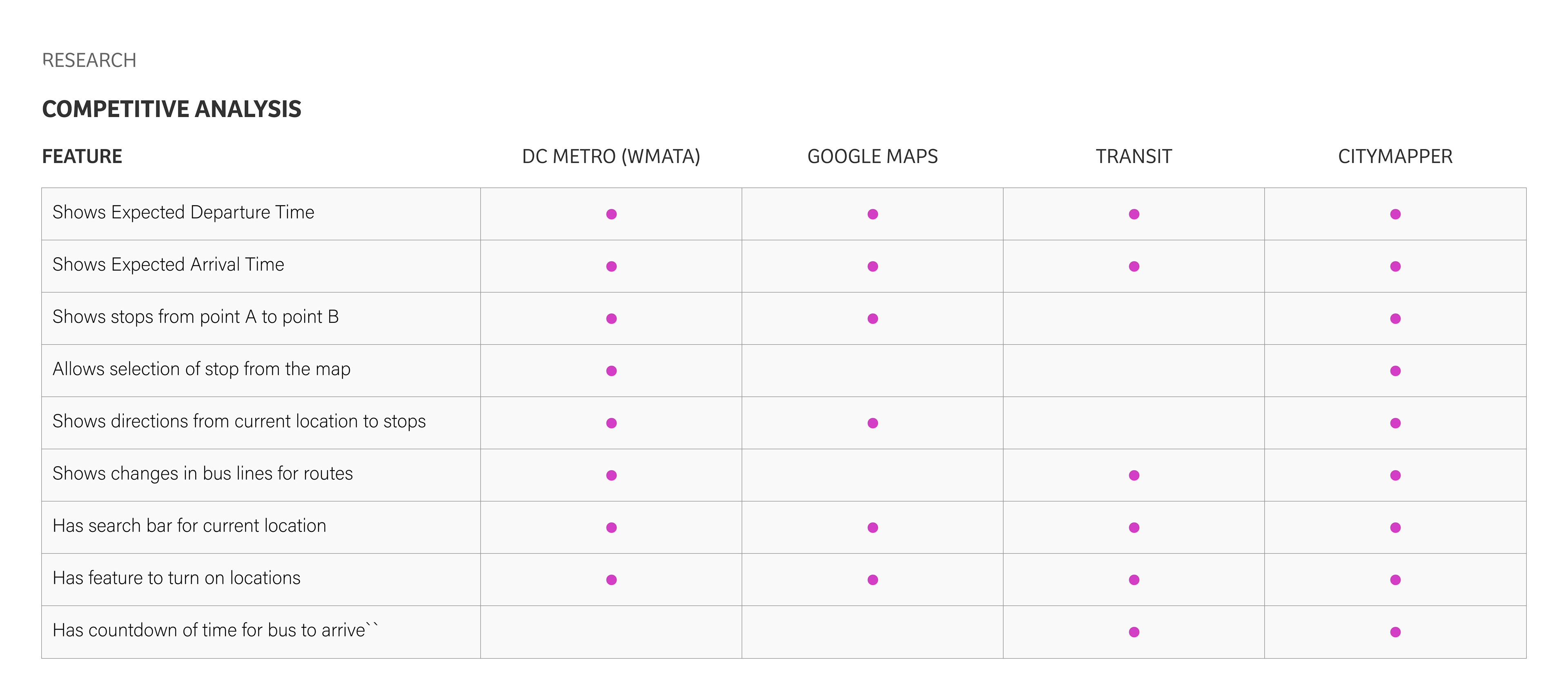
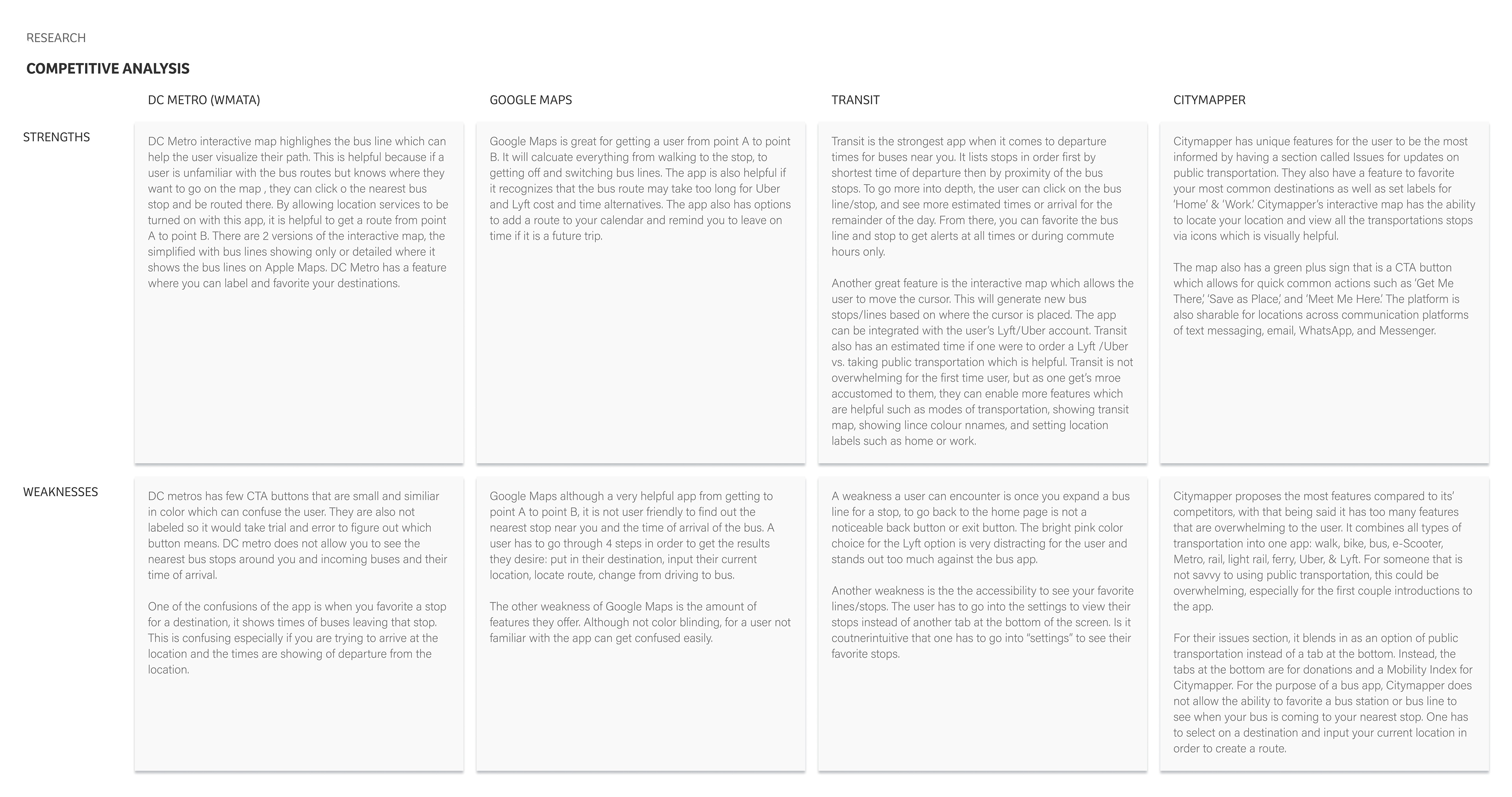
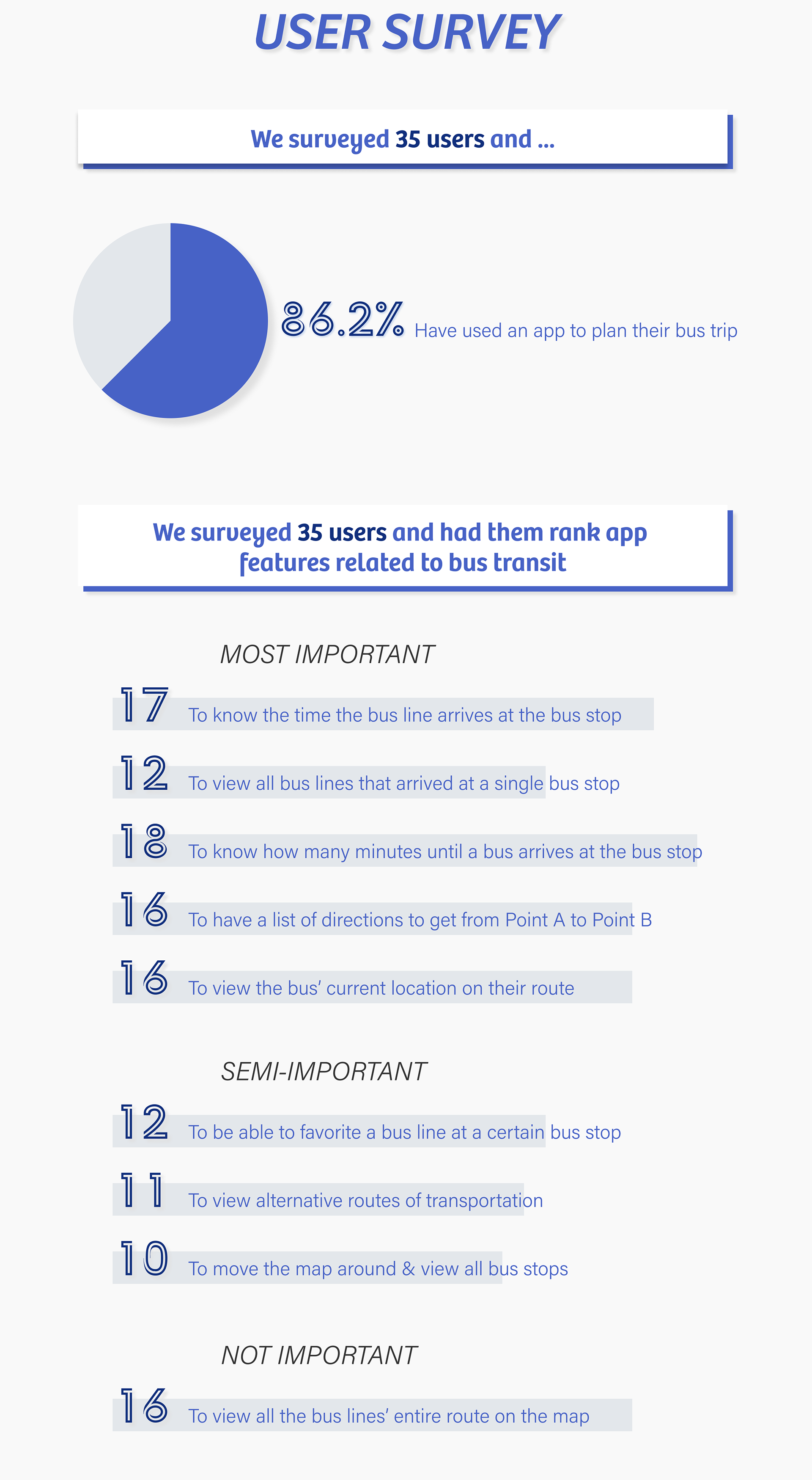
To figure out how to create an app for a metropolitan city, I downloaded the most popular bus transportation apps that tailed for major cities: DC Metro, Transit, & Citymapper. I then compared the 3 apps to Google Maps to see how it compared for features. Each app shared the common features, but varied depending if it was created for only local bus lines or public bus lines. In order to determine which feature was an MVP, I conducted an online user survey.
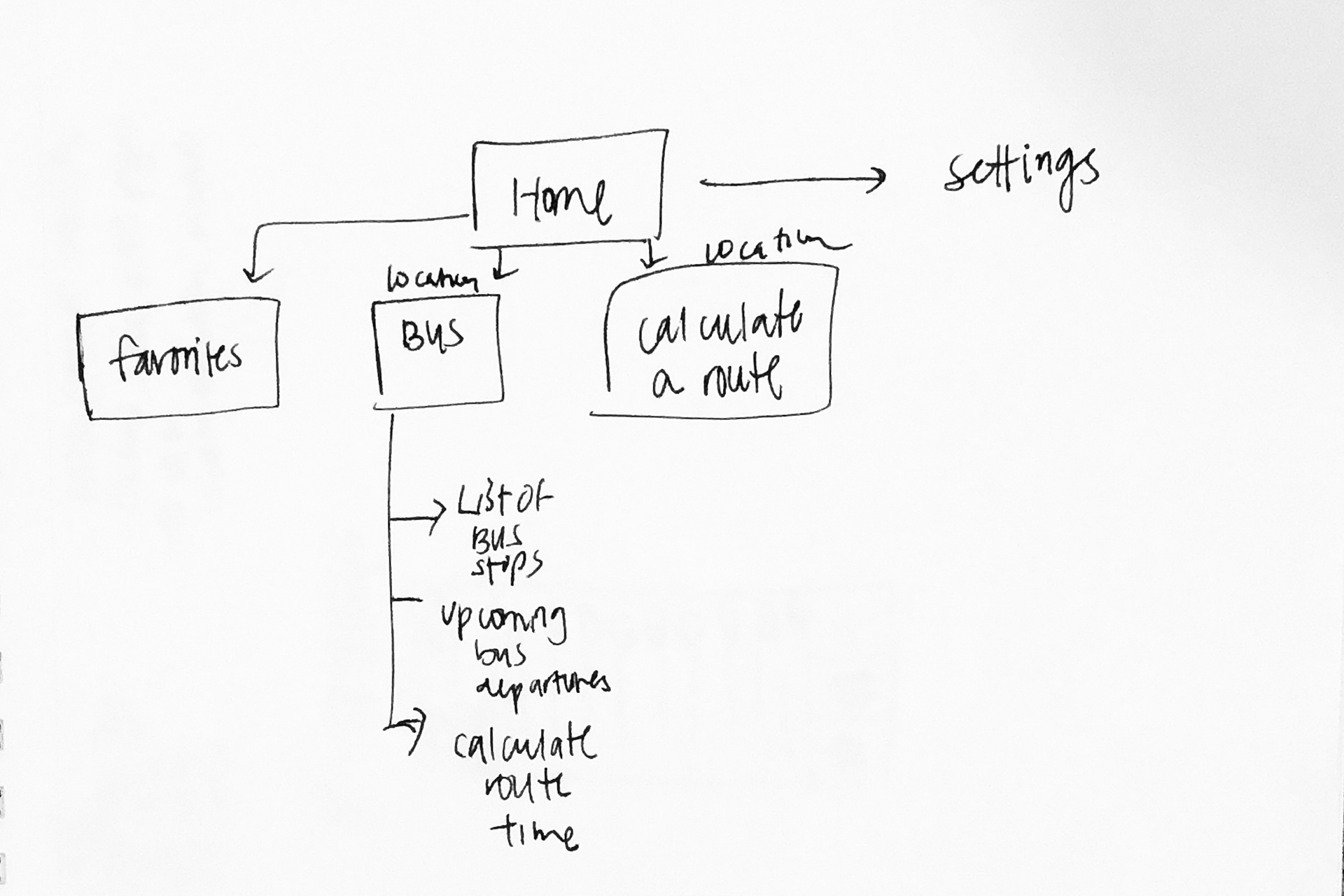
Information Architecture
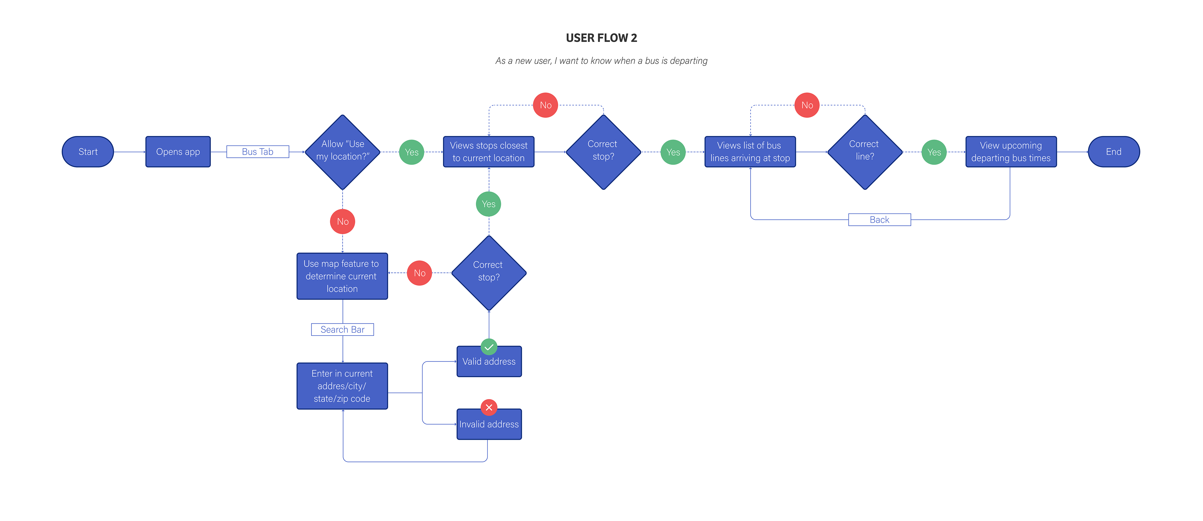
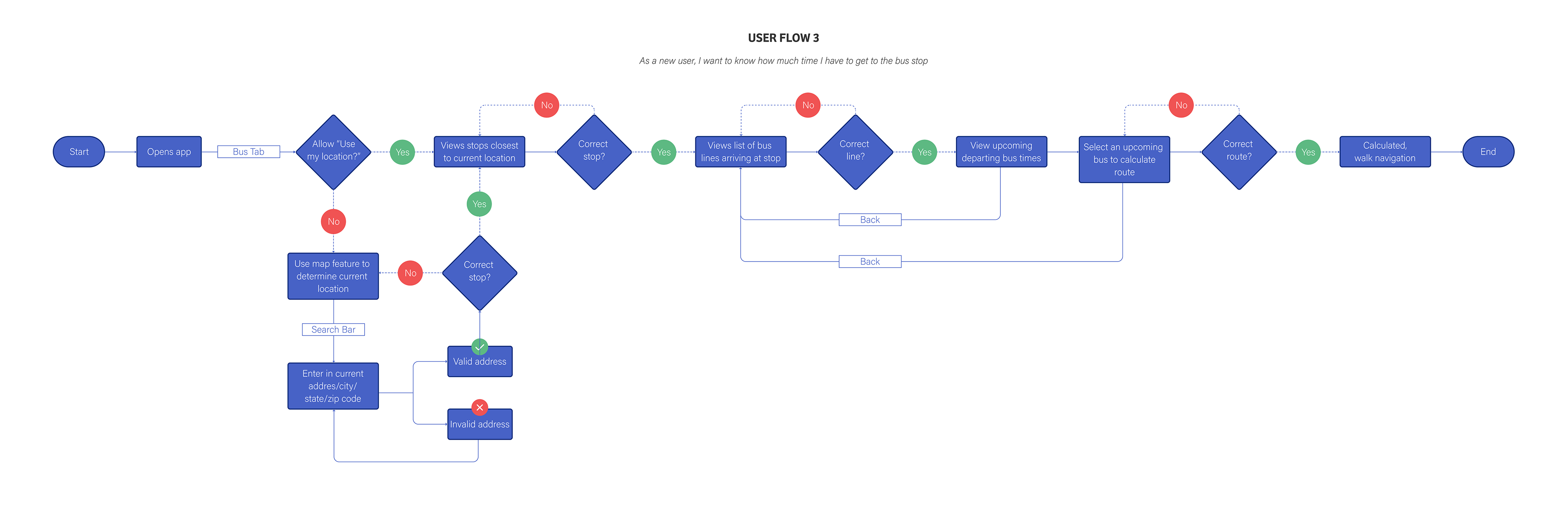
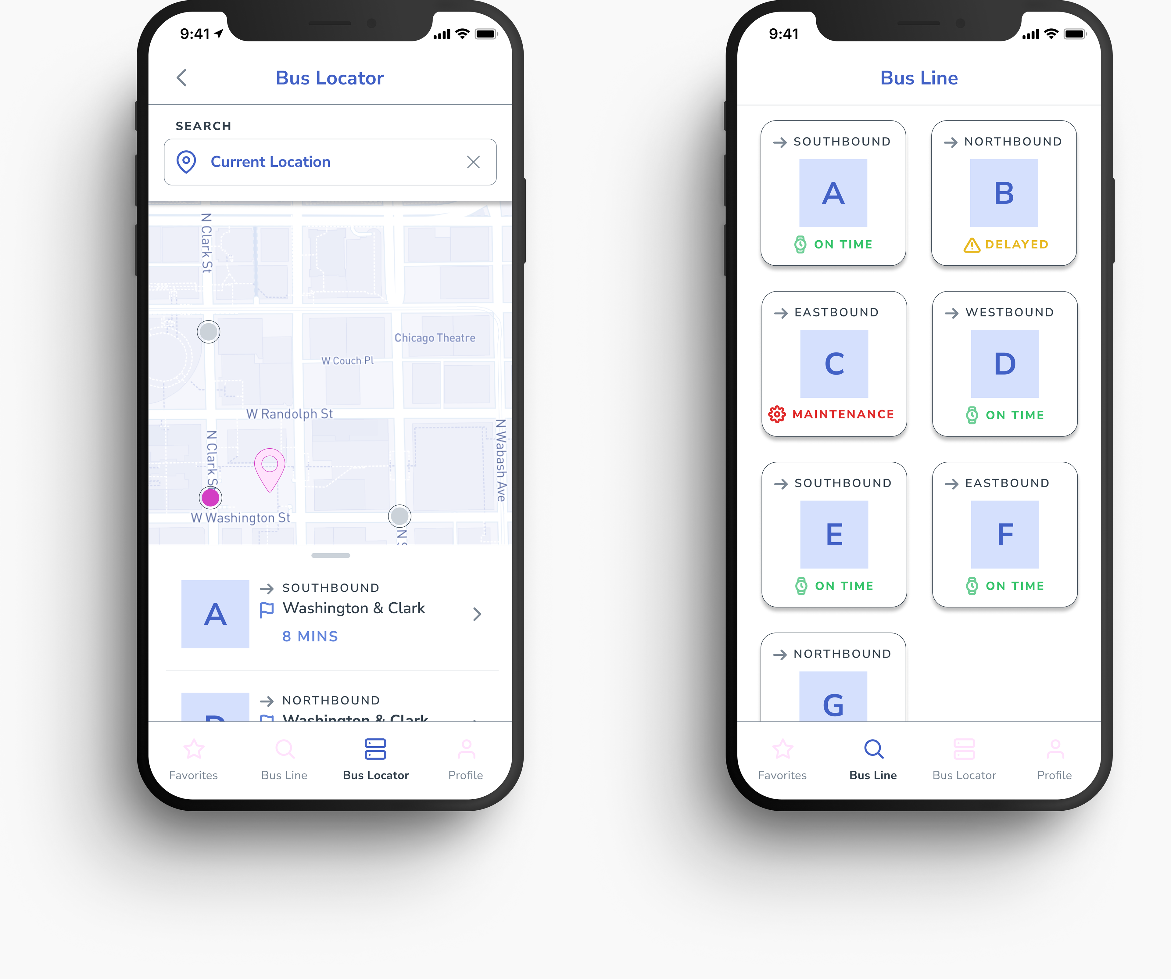
The 3 MVPs for the bus app is broken down to the 3 core functions: to look at when buses arrive, to know when a bus is departing, and to figure out how much time a user has before the bus arrives.

Ideation
After determining our user flows, I began creating a site map and sketching wireframes. With both the user pain points and client requirements, the user flows overlapped into one function of the app. To complete the app, I chose the next 2 MVPs determined from the user surveys.
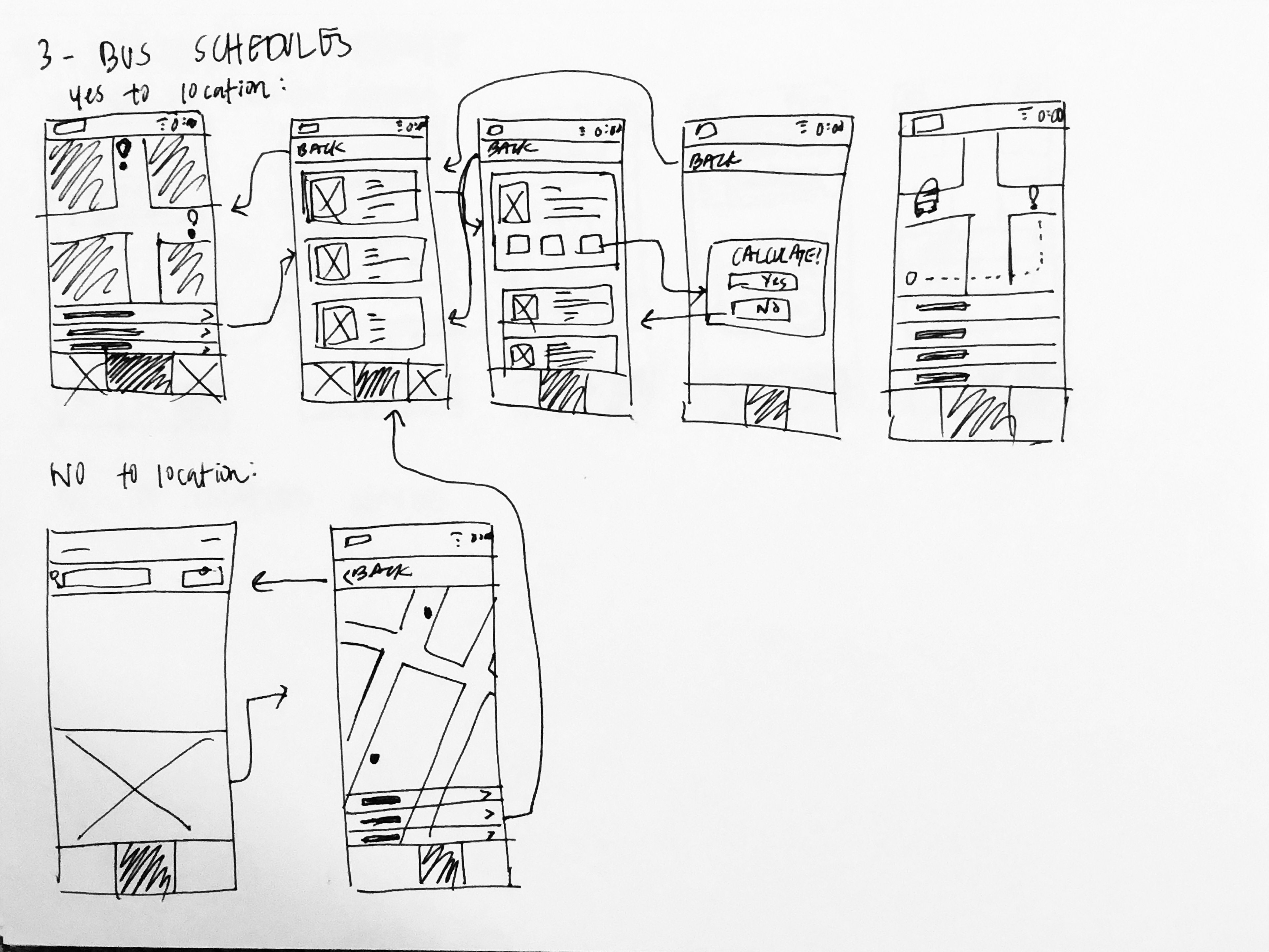
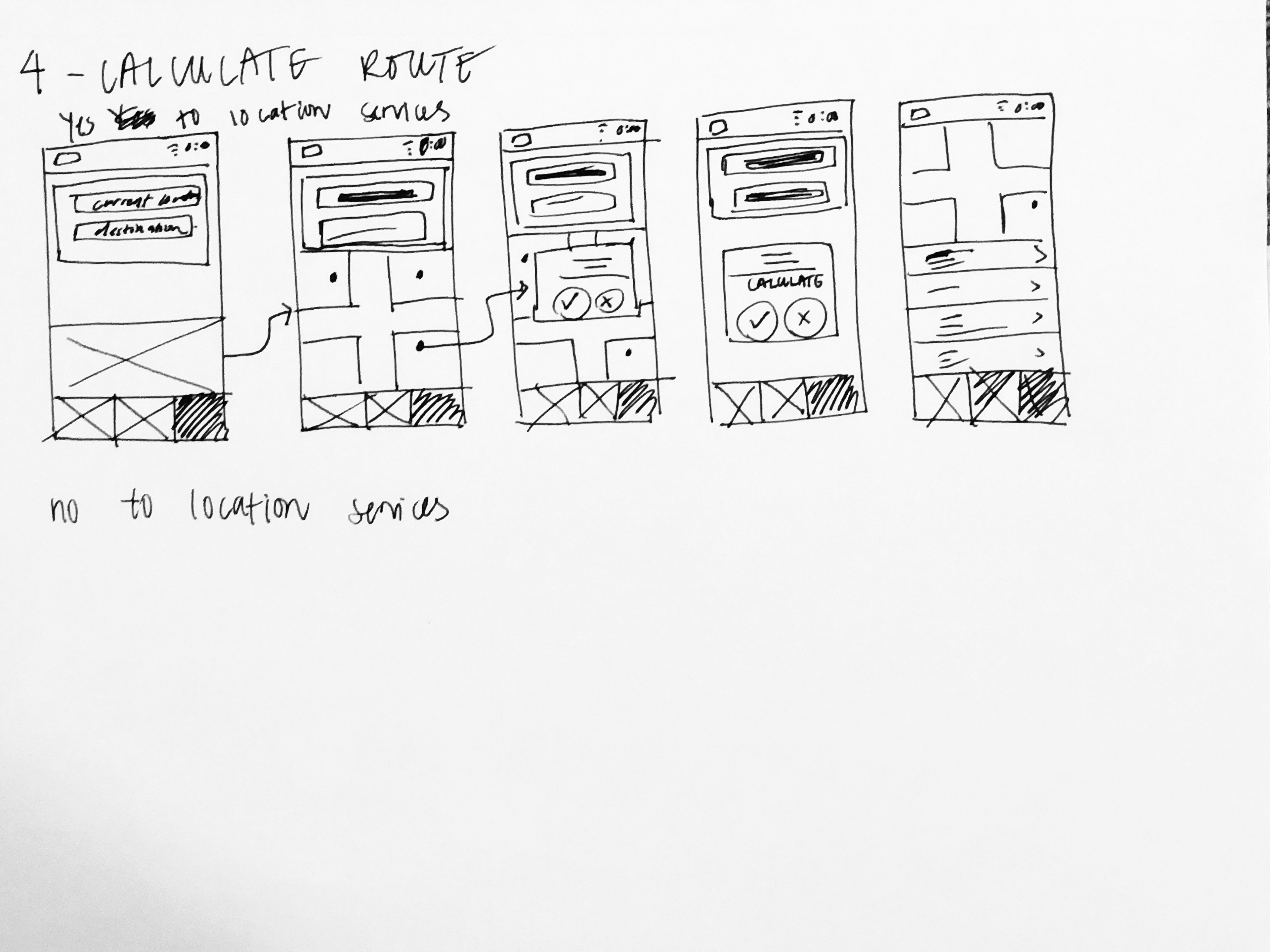
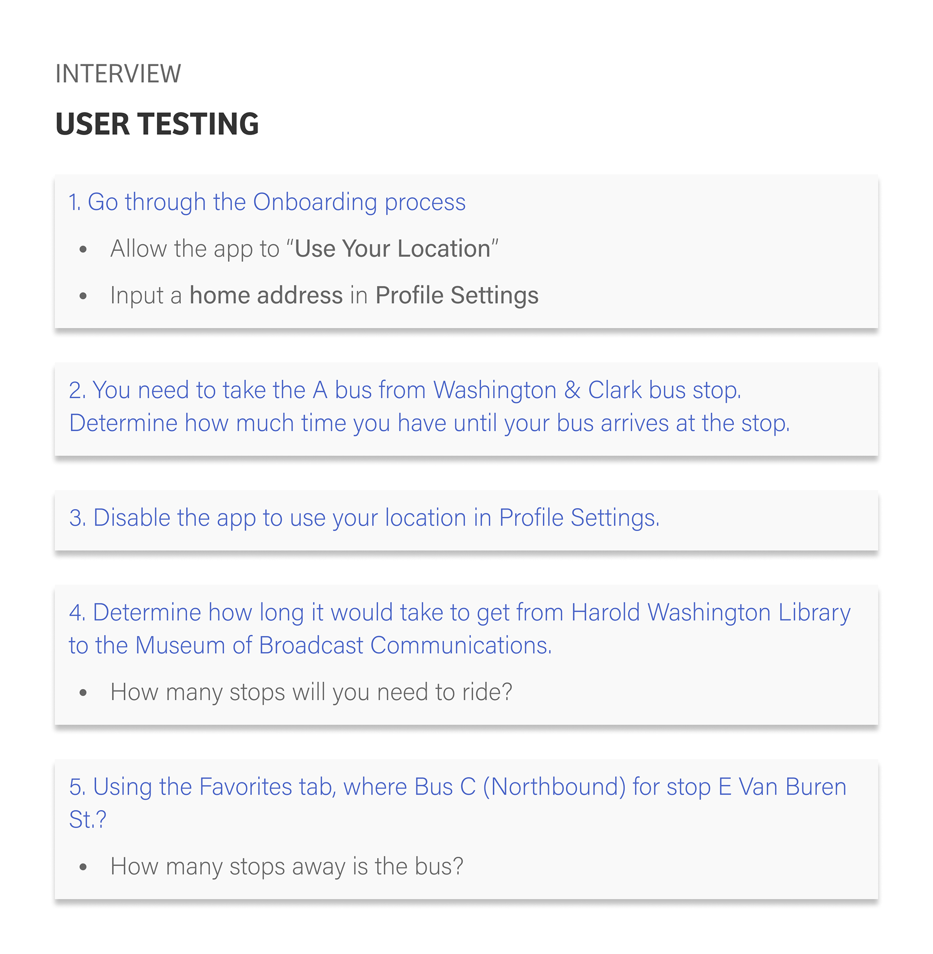
Interview
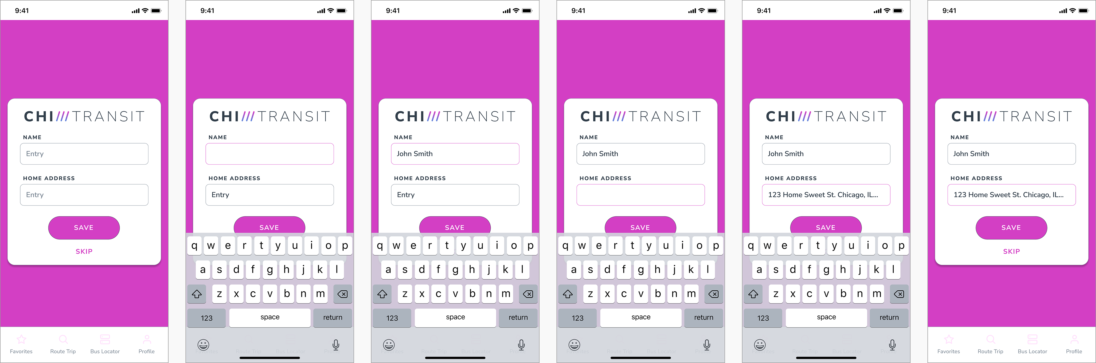
Follow along the low-fidelity clickable prototype for the user testing.
BEFORE
AFTER
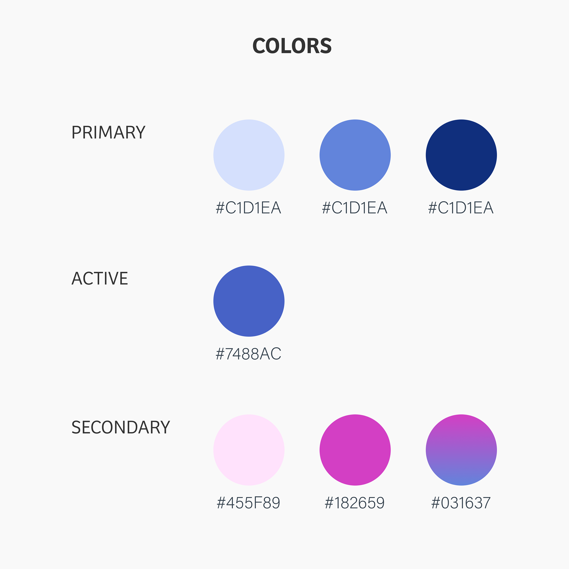
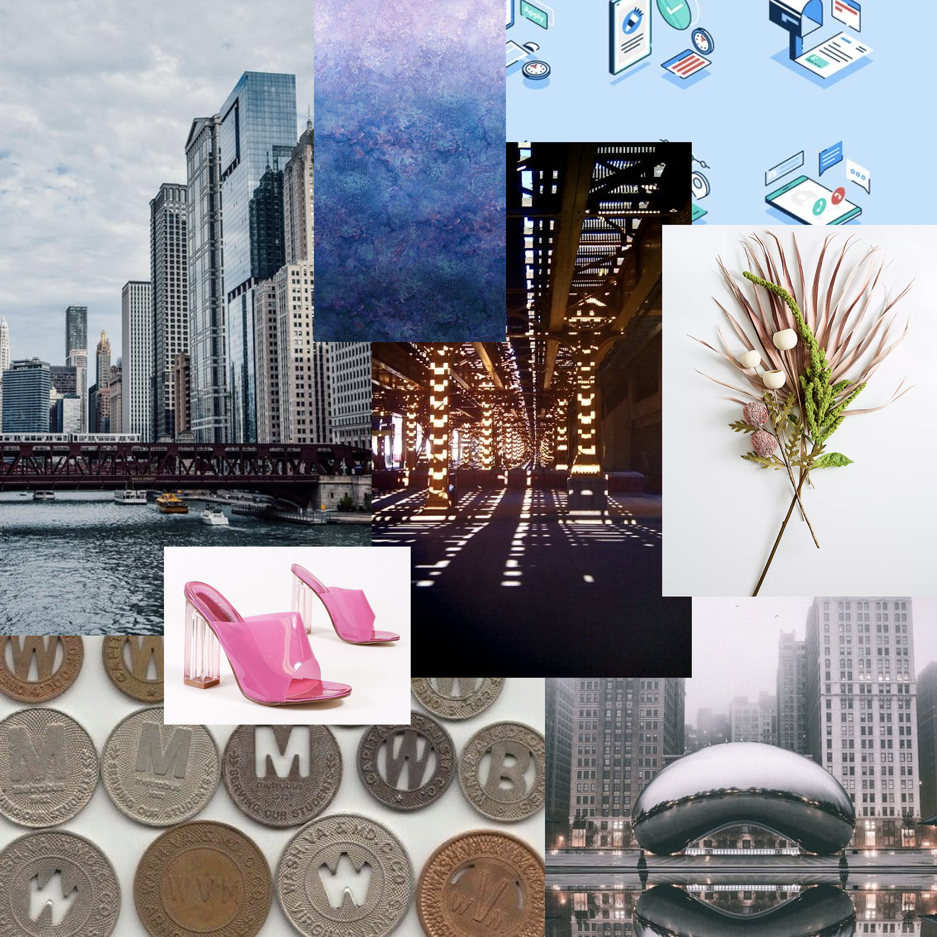
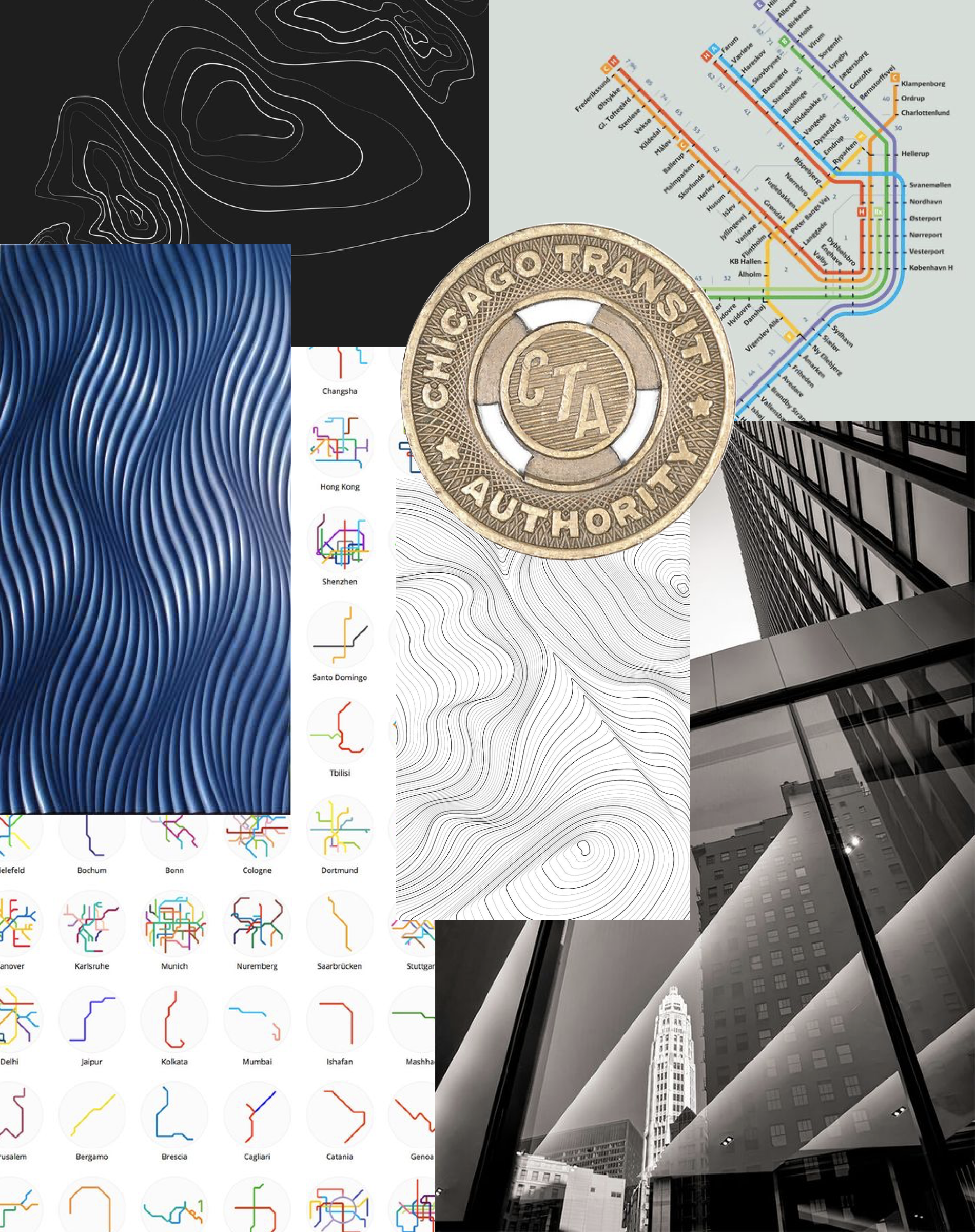
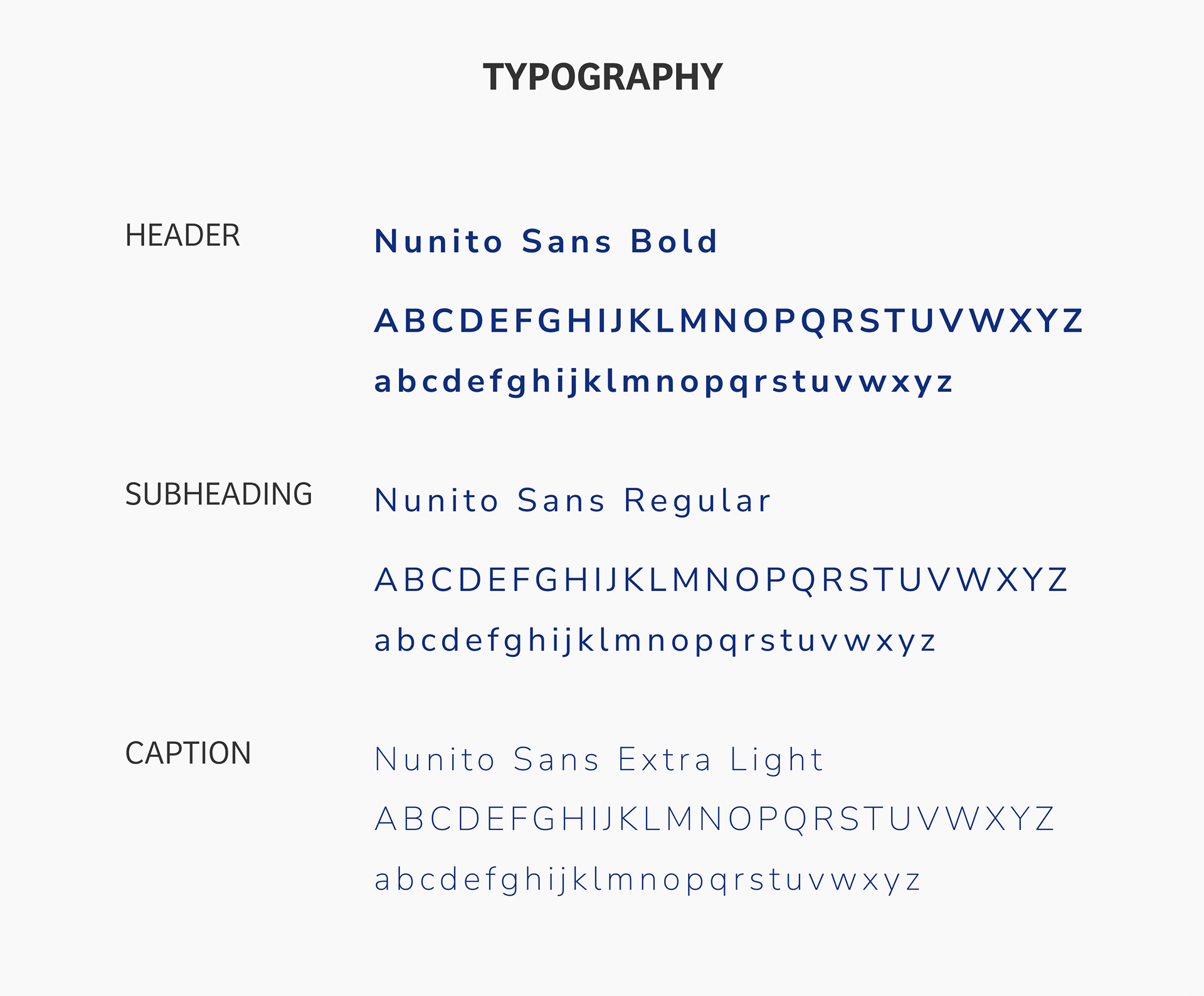
Brand Development
In developing the color concept, we wanted the app to feel informative and playful. Blue allows the user to understand that the app is portraying information information, while the bright pink allows for a stark contrast for alerts. With bus arrivals and time departure being time sensitive having a vibrant color was important as well to accommodate accessibility needs.
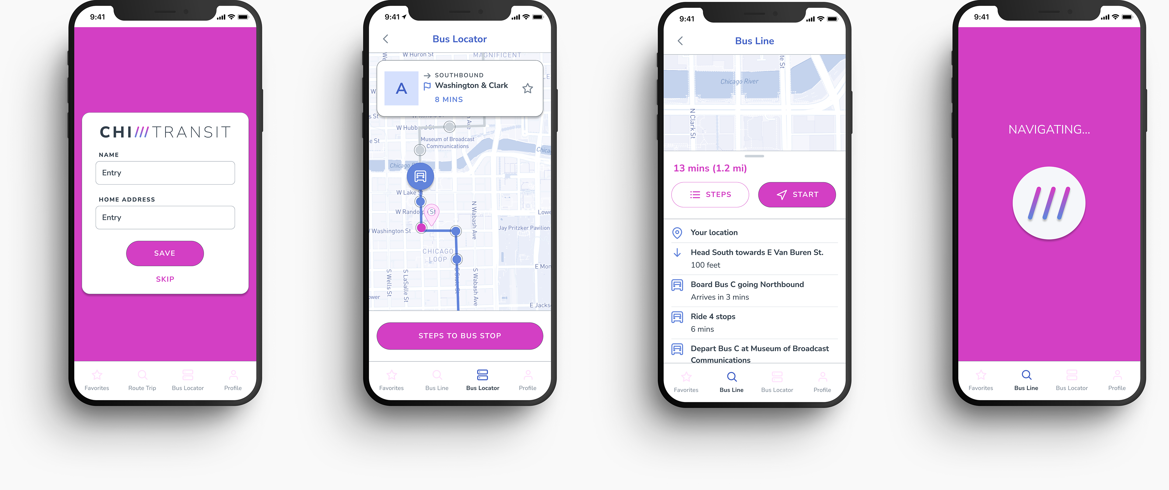
HIGH FIDELITY PROTOTYPE
View the clickable, high fidelity prototype here.
FINAL THOUGHTS
As a transit app, CHI Transit is a simple informative app centered around the core functions of knowing when a bus is arriving and departing at a bus stop. The goal was not to not overwhelm users with features they may not be familiar with and to mimic user flows they are familiar with.
One of the accomplishments was desiging for accessibility when relaying information on the app such as time, bus direction, etc. One of the biggest errors of other apps is overusing color which makes it hard for those that are colorblind. By adding in universal symbols such as a watch and alert, this allows those who are colorblind understand quickly the statuses of buses.
The biggest obstacle was deciding which features were most important initially to the user. With all the other bus apps out on the market advanced in features, it was easy to get overwhelmed and distracted with other MVPs during the brainstorming page. However, once we released the user survey and were getting results from users on what they deemed as MVPs, it was easy to consolidate and determine how we should structure the app and start wireframing.